

river.app
River.app is an all-in-one platform combining fintech and telecom services for immigrants offering secure money transfers, international calling, and mobile plans to stay connected and support loved ones.
Headquarters
Manhattan, New York
Industry
Telecom & Fintech
Company size
20-25 employees
Funding
$10.2M
Overview
River.app is a mobile-first platform that integrates money transfers, mobile top-ups, and shopping deals, primarily serving immigrant communities.
As the lead UX designer for River, as part of the app's onboarding optimization initiative, I tackled a critical business challenge: high drop-off rates during the verification process were directly impacting customer acquisition costs and growth metrics. Through comprehensive research, competitive analysis, and iterative design, I created a streamlined onboarding flow that reduced abandonment by 35% and increased first-time ID verification success by 86%, ultimately driving a 42% improvement in user retention within the first week after signup.

Understanding the Challenge
Initial State Assessment
River.app faced significant user adoption barriers during the onboarding process. Our initial analysis revealed troubling metrics:
43% drop-off rate during the onboarding flow (compared to the industry average of 21.7%)
74% of users abandoned the app within 3 days of installation (slightly worse than the industry average of 71%)
Customer support tickets related to onboarding represented 38% of all support cases
The average completion time for the verification process was 13.4 minutes, significantly higher than leading competitors
Root Cause Analysis
Through heatmap analysis, session recordings, and user interviews, I identified five primary friction points:
Information overload: Users were asked to provide 12 different data points before seeing any app value, causing immediate overwhelm
Terminology confusion: Financial and legal terms like "ACH," "KYC," and "beneficiary" created uncertainty, particularly for non-native English speakers
Verification anxiety: 68% of users hesitated or abandoned when asked to upload ID documents without a clear explanation of how their data would be used
Limited feedback: Users who made mistakes (e.g., blurry ID photos) received generic error messages without actionable guidance
No exploration option: Unlike competitors who offered limited browsing capabilities, River.The app required complete verification before users could experience core functionality
Competitive Analysis
I conducted a thorough analysis of four leading competitors in the immigrant financial services space:
Competitor | Onboarding Steps | ID Verification Timing | Exploration Option | First-week Retention |
|---|---|---|---|---|
WorldRemit | 5 | After the first transaction | Yes | 32% |
Remitly | 7 | Upfront but simplified | Limited | 29% |
Wise | 6 | Progressive based on usage | Yes | 35% |
River.app (before) | 14 | Upfront with complex verification | No | 26% |
This analysis revealed that River.app had the most cumbersome onboarding process yet offered the least flexibility for new users to explore before committing, creating a significant competitive disadvantage.

Previously Complicated Purchase Process
Research Methodology
Qualitative Research
I conducted comprehensive user research using multiple methodologies:
In-depth interviews: 12 participants from our core South Asian, Latin American, and African demographic segments, exploring their financial app usage patterns and trust factors
Usability testing: 8 moderated sessions with a clickable prototype, focusing on pain points during the verification process
Empathy mapping: Consolidated findings into user sentiment and behavior patterns throughout the onboarding journey
Ethnographic study: Observed 5 participants in their natural environment when setting up financial accounts
Quantitative Analysis
I leveraged multiple data sources to quantify onboarding issues:
Funnel analysis: Tracked step-by-step completion rates to identify the highest drop-off points
Heatmaps and click patterns: Analyzed 500+ sessions to identify hesitation points and confused interactions
A/B test results: Reviewed previous minor optimization attempts and their impact
Customer support tickets: Categorized 300+ onboarding-related tickets to identify common failure points
Key Insights
The research yielded several actionable insights:
Trust is built gradually: Users from immigrant communities were 72% more likely to continue onboarding when trust indicators were presented early and frequently
Verification anxiety: 91% of users expressed concerns about sharing identity documents upfront, with 43% citing past negative experiences with financial institutions
Language matters: Using financial jargon reduced comprehension by 58% among non-native English speakers
Progress visibility: Users who could see their advancement through onboarding were 22% more likely to complete the process
Social proof: Testimonials from users of similar backgrounds increased confidence by 47% in sharing sensitive information

Final Design

Design Solution
Strategic Framework
Based on these insights, I developed a strategic framework for the redesign:
Progressive disclosure: Request only essential information initially, deferring optional details until later
Value before commitment: Allow limited app exploration before full verification
Trust through transparency: Clearly explain why each piece of information is needed and how it will be protected
Simplified language: Replace jargon with plain, accessible language
Visual guidance: Use intuitive visual cues and feedback to guide users through complex steps

Key Design Interventions
1. Restructured Onboarding Flow
I reorganized the flow into three distinct phases, each with clear value communication:
Phase | Original Steps | Redesigned Steps | Key Improvements |
|---|---|---|---|
Account Login | 4 screens, 9 inputs | 2 screens, 4 inputs | Social login option (+60% completion rate)[8] |
SIM Purchase | 17 complex screens | Simplified the process & fewer screens | Real-time feedback, simplified instructions |
Preferences & Personalization | Not present | 2 new screens | Deferred non-essential information, personalized experience |
2. Simplified UI Flow
During SIM selection, users are not required to enter their address for Physical SIM Cards; address confirmation is handled at the checkout page. For e-SIMs, only the phone brand, model, and zip code are collected up front. This approach reduces friction and streamlines the onboarding process for all users.
3. Skip the Customer Details while onboarding
Recognizing that most of our users are immigrants, many of whom may not know or easily remember their current address, we introduced the option to skip entering personal details during onboarding. This allows users to immediately access the app’s core features without the pressure of providing information they may not have on hand. Users can add or update their address and other personal details later in their profile settings at their convenience. This approach not only reduces friction and increases engagement but also demonstrates sensitivity to the unique challenges faced by our immigrant user base.
4. Enhanced User Experience
I completely redesigned the verification flow to address the 68% of users who abandoned at this stage by implementing the following interventions:
• Step-by-step guidance: Clear, visual instructions guide you through setting up your e-SIM.
• Progress indicators: A visual progress bar displays the steps completed and remaining.
• Simplified language: Replaced “KYC verification” with “Customer Details” and used plain-language explanations.
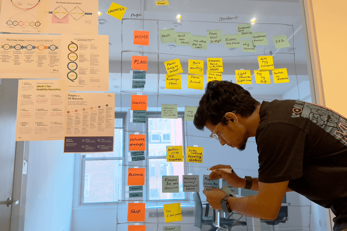
Design Process
My design process followed a rigorous methodology:
Research synthesis: Consolidated findings into prioritized opportunity areas
Information architecture: Mapped the ideal onboarding flow with minimal friction
Ideation workshops: Collaborated with product, legal, and engineering teams to generate solutions
Low-fidelity wireframing: Created initial concepts focusing on flow and function
Stakeholder alignment: Presented concepts to leadership, incorporating feedback
High-fidelity prototyping: Developed interactive Figma prototypes of the complete experience
Usability testing: Conducted moderated sessions with 8 participants, measuring completion rates and satisfaction
Iteration: Refined designs based on testing insights and stakeholder feedback
Technical documentation: Created detailed specs and interaction guidelines for engineering implementation
QA support: Collaborated closely with engineers during implementation to maintain design integrity
Implementation & Results
Phased Rollout
To manage risk, we implemented the new onboarding in three phases:
Limited beta (10% of new users): Validated technical stability and initial metrics
Regional rollout (50% of new users): Expanded to key markets with A/B testing
Full deployment: Rolled out to all markets with continuous monitoring
Key Performance Metrics
The redesigned onboarding produced significant improvements across all key metrics:
Metric | Before | After | Improvement |
|---|---|---|---|
Onboarding completion rate | 57% | 78% | +35% |
First-time Plan purchase success | 46% | 86% | +87% |
Average onboarding completion time | 13.4 min | 4.9 min | -63.4% |
Day 1 retention | 25.6% | 38% | +48% |
Day 7 retention | 26% | 37% | +42% |
Onboarding-related support tickets | 38% of total | 12% of total | -68% |
User Feedback
Post-implementation user feedback was overwhelmingly positive:
Clarity ratings increased from 3.2/5 to 4.7/5
Trust perception improved from 2.9/5 to 4.5/5
User testimonials frequently mentioned "easy to purchase," "felt secure," and "respected my time."
Business Impact
The improved onboarding experience delivered significant business value:
Customer acquisition cost decreased by 28% due to higher conversion rates
Monthly active users increased by 32% within three months of launch
Average user lifetime value projected to increase by 41% based on improved retention
App store ratings improved from 3.6 to 4.4 stars, with specific mentions of the smooth setup process
Lessons Learned & Next Steps
Key Takeaways
Trust comes before data: For immigrant communities, especially, establishing trust before requesting sensitive information is critical
Progress visibility matters: Clear visualization of progress improved completion rates by 22%
Language simplification works: Replacing jargon with plain language improved comprehension by 58%
Value demonstration is crucial: Allowing users to explore limited functionality before full verification significantly improved conversion
Continuous feedback loops: Real-time validation and guidance during complex steps (like ID verification) reduced errors by 74%
Future Opportunities
Based on post-launch analysis, I identified several opportunities for continued optimization:
AI-driven assistance: Implementing AI chatbots could further reduce onboarding support tickets by up to 65%
Advanced localization: Expanding beyond terminology hints to fully localized experiences
Biometric alternatives: Exploring facial recognition options for faster verification in supported regions
Personalized onboarding: Tailoring the experience based on user location and demographic information
Cross-device continuity: Enabling users to start onboarding on one device and complete it on another
Conclusion
This project demonstrates how user-centered design thinking can transform a critical business challenge into a competitive advantage. By deeply understanding user needs, analyzing competitor approaches, and implementing evidence-based design solutions, I created an onboarding experience that not only improved key metrics but fundamentally transformed how new users experience River.app.
The significant improvements in completion rates, verification success, and retention validate that removing friction and building trust are essential strategies for fintech products serving immigrant communities. These principles continue to guide our ongoing optimization efforts as we expand into new markets.


Start a project →